A dark bedroom ceiling: deep blues, plums and texture for a cosy, cave-like room
A navy, plum or charcoal bedroom ceiling: Benjamin Moore colours, ceiling textures, sheen, lighting and what colour psychology says about calm rooms.
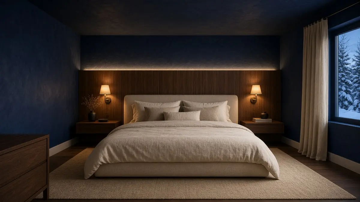
Yes, a bedroom ceiling can go dark, and in the right room it's one of the cosiest things you can do with paint. A deep navy, plum or charcoal ceiling brings the room in around you, and wrapping the same colour down the walls makes it feel calm and enveloping rather than heavy. It works best with a flat or matte finish, a ceiling that's well prepared, and warm, low lighting.
Here's how to choose the colour, what texture does under dark paint, and the honest tradeoffs before you commit.
Why a dark ceiling feels like a cave (in a good way)
A white ceiling bounces light back down and reads as "up there". A dark ceiling soaks light up, so the edges of the room soften, especially at night. Research on how we judge room height backs up what designers have long said: people judge rooms with darker ceilings as lower, and rooms with lighter ceilings as higher. That's the effect you're after here. The room feels closer and more sheltered, like a reading nook or a well-made tent.
Sherwin-Williams makes a similar point from the design side: carrying one colour across the walls and ceiling of a small room gives it "a restful, soothing mood", which it suggests for bedrooms and baths. It also notes that with a dark ceiling over white walls, the ceiling can read like a night sky.
Colour and calm: what people say
Colour psychology is the study of how colours shape the way we feel. It's a mix of research, design experience and plenty of personal taste, so take it as a guide rather than a rule. The common patterns are clear enough to be useful when you're choosing a bedroom colour.
Colours many people describe as restful
- Blues are the colour most often linked with calm. Verywell Mind's overview describes blue as "peaceful, tranquil, secure, and orderly", with the caveat that some blues can feel cool or distant. The BBC's home-design guide lists bedrooms among the best rooms for blue and suggests a blue with a warm undertone so it doesn't feel chilly.
- Deep greens come up often too, tied to nature and quiet.
- Soft plums and muted purples are a favourite for a moody, wrapped-up bedroom, though they divide people more than blue does.
- Muted darks like soft charcoal read as quiet and grounded, especially with warm wood and linen.
Colours many people describe as energizing
- Warm reds, oranges and bright yellows are usually described as lively, warm and stimulating. That's great in a dining room or a mudroom. In a bedroom most people keep them to a throw, a lamp or a piece of art. The Sleep Foundation calls red "stimulating", and the BBC's guide suggests red for sociable rooms like dining rooms.
What people who've done it say
On Reddit's home-decorating forums, people who've painted their bedrooms dark use the same words again and again: "cozy", "cocooned", "like a cozy little cave". One person who wrapped walls and ceiling in navy because the room got little light said they "absolutely love it". Others who chose Hale Navy for a bedroom or guest room called it "so cozy in the evening".
It isn't for everyone. Some people find a dark room gloomy, especially a main living space they use all day, and one person who painted a living room and ceiling navy said every lamp "turned into a spotlight" and later repainted. A common tip from those threads: keep some light things in the room (bedding, a rug, art), and if you're unsure, take the ceiling a step or two lighter than the walls.
What the research says, briefly
- A 2015 survey-based study of 102 adults found no difference in sleep quality between people with blue or green bedrooms and other colours. It did find that people in darker-coloured bedrooms reported feeling more serene, and that feeling was linked to better sleep. It was small and self-reported, so it's a hint, not proof.
- A widely shared 2013 Travelodge poll of 2,000 British homes reported that people with blue bedrooms slept the longest. It's a hotel chain's consumer poll, not a scientific study, but it's where a lot of "blue for bedrooms" advice comes from.
- Light matters more than paint. A study in the Journal of Clinical Endocrinology & Metabolism found that ordinary room light in the evening delayed and shortened melatonin, the hormone linked with night-time, compared with dim light. A dark ceiling reflects less of that light back into the room. Warm, low lamps do the rest.
We can't promise any colour will change how you sleep or feel. What we can say is that many people find a deep, quiet colour, with warm low light, makes a bedroom feel like a place to wind down.
Choosing the colour: Benjamin Moore picks
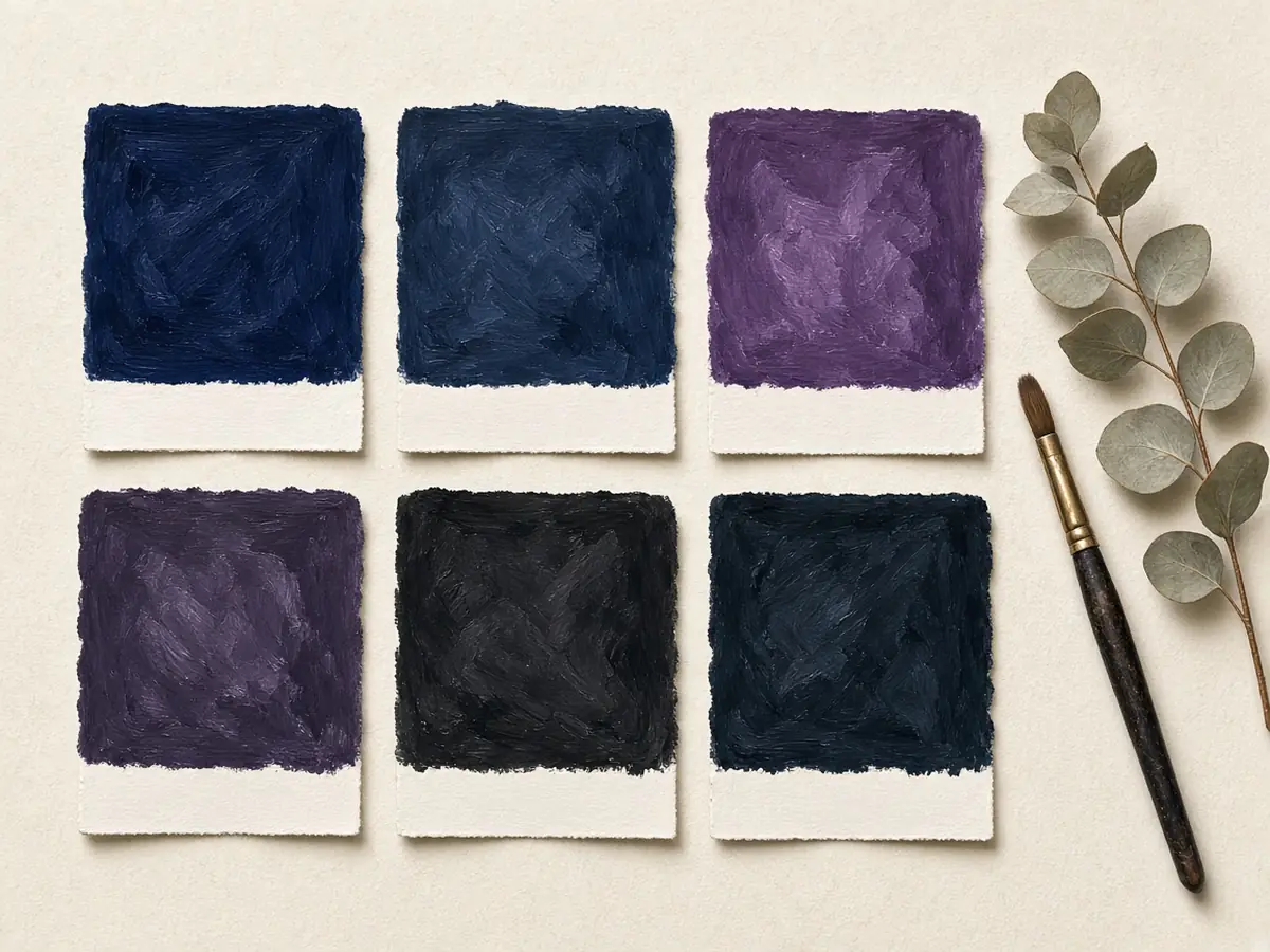
Dark colours change a lot between daylight and lamplight, so these are starting points to sample, not final answers. LRV (light reflectance value) runs from 0 (black) to 100 (white); all of these sit below 10, which is what gives the cave feel.
Blues
- Hale Navy HC-154 (LRV 8.36). Benjamin Moore calls it "a use-anywhere shade of navy". A classic, steady navy that stays blue in lamplight rather than going black. A good first choice if you want "dark" without drama.
- Mysterious AF-565 (LRV 8.76). Described as "a compelling denim blue that can read as a black paint colour or a rich navy". At night it reads almost black; in daylight the blue comes back.
Plums and aubergines
- Shadow 2117-30 (LRV 9.3). Benjamin Moore's 2017 Colour of the Year, "a rich, royal amethyst" that can fade to lilac-grey or "morph into lustrous coal". The most colourful of the group, and lovely with warm brass and wood.
- Vintage Wine 2116-20 (LRV 8.2). "Combines the versatility of gray with the elegance of violet." A quieter, greyed plum, easier to live with than a bright purple.
- Caponata AF-650 (LRV 6.36). Benjamin Moore describes it as a rich brown "infused with purple undertones". A deep aubergine that leans warm, so it glows rather than chills under 2700K bulbs. The darkest of the plums.
Dark neutrals
- Wrought Iron 2124-10 (LRV 8.17). "A shade of black beloved for its relatively soft, malleable character." A soft charcoal that reads gentle rather than stark.
- Midnight Oil 1631 (LRV 7.67). Described as "this dark, enveloping hue." A deep charcoal with a faint cool undertone; with warm bulbs it feels like a quiet evening.
For contrast, the energizing end: Benjamin Moore describes Caliente AF-290 as a red "full of energy" and Yellow 2022-10 as conveying "cheer and imagination". Lovely colours, and good examples of what most people keep out of a room meant for winding down.
How to test: paint large samples (or sample boards) and look at them on the ceiling and on the wall, by day and at night with your own lamps on. A colour that looks blue on the chip can look nearly black overhead.
Ceiling texture under dark paint

Texture is what turns a dark ceiling from a flat lid into something that feels carved. Deep paint pulls every rise and hollow forward: the high points catch the light, and the low points hold shadow.
Our approach: a bubbled, pocked ceiling. For a cave-like bedroom, we apply the mud by hand and don't smooth it. We leave it bubbled and pocked, so the ceiling reads like the inside of a grotto, weathered stone or the roof of a cave. No two ceilings come out quite the same. Under a flat navy, plum or charcoal and a warm wall light, it looks organic and made by hand rather than sprayed on.
It's more pronounced than the textures most people know:
- Knockdown: spattered compound flattened with a wide knife. A softer, mottled look.
- Skip trowel: applied with a trowel at a low angle, leaving irregular raised patches.
What to know before you choose it
- Dark paint amplifies it. Peaks catch light and pockets hold deep shadow. That's the point, but it means the texture has to be laid out with care across the whole ceiling.
- It reads heavier and lower. A pocked dark ceiling feels lower than a smooth or lightly textured one. In a cave-like bedroom that's usually the goal; in a low, small room, think about it.
- Done well it looks artisanal; done badly it looks unfinished. Uneven or careless pocking can read as a ceiling someone didn't get around to finishing. Keeping it consistent and intentional is skilled hand work.
- Painting it takes a gentle hand. The raised mud shouldn't be crushed or flattened, so it's usually sprayed with an airless sprayer, or rolled with a thick-nap roller and light pressure.
- Flat sheen is essential. Any shine turns the peaks into hot spots of glare. Dead flat keeps the shadows soft.
- It takes more paint than a smooth ceiling, because there's far more surface to cover.
- Dust settles in the pockets. A soft brush on a vacuum or a soft duster now and then keeps it clean. Avoid rubbing, since deep flat colours can burnish (go shiny).
- It's hard to undo. Taking a heavily textured ceiling back to flat means skim-coating over it, so choose it because you want it for the long run. If you'd rather have a smooth dark ceiling, that's where a Drywall & Level 5 finish earns its place, because flat dark paint on a smooth ceiling shows every joint and roller lap in side light.
- Going back to a light colour later takes work. Covering a dark colour means a good primer and extra coats, so it's worth choosing a colour you'll want to live with for a while.
Already have a popcorn ceiling? We can texture right over it. There's no need to scrape it off first. If the popcorn has already been primed with an oil-based primer, we apply the new texture straight over it. If it's unprimed, we seal it first with one coat of oil-based primer, apply the bubbled, pocked texture, prime again with oil-based primer, then finish with two to three coats of the deep colour. The oil primer seals the popcorn so the moisture in the new mud and paint is less likely to soften it or loosen it from the ceiling. In a home built before about 1990, have the popcorn tested before any work. Texturing over it rather than scraping it avoids disturbing it, but it should still be tested first so everyone knows what's there. Health Canada notes asbestos was widely used before 1990 and can still be found in older ceiling materials and surface treatments, and it advises hiring a professional to test before renovating. Left undisturbed and in good condition, it isn't considered a significant risk. Ontario's asbestos regulation for construction and renovation work (O. Reg. 278/05) sets out how material is sampled, tested and handled. New texture over sound drywall doesn't raise any asbestos question.
Ceiling only, or wrap it down the walls?
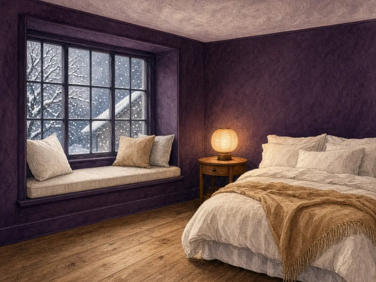
There are three common ways to do it:
- Wrap it all (colour drenching). Walls, ceiling and often trim in one colour. The edges disappear, which is what makes it feel cave-like. Designers often say this works better than a dark ceiling over light walls, which can feel like a lid.
- Same colour, lighter ceiling. Take the ceiling 25 to 50 percent lighter than the walls (your paint store can mix this from the same colour). Still cohesive, a little more air overhead.
- Dark ceiling only. Light walls, dark ceiling. Dramatic, and best with a high ceiling or a room with interesting mouldings.
Room size and ceiling height: a dark ceiling lowers a room visually. In a bedroom with a tall or vaulted ceiling that's often welcome; it brings a big room down to human scale. In a small room with a low (around 8 ft) ceiling, wrapping the colour all the way round usually feels calmer than a dark lid over pale walls, or try the lighter-ceiling version.
Sheen
For the ceiling, flat is the usual choice, and on a bubbled, pocked texture it's essential. Flat paint doesn't throw glare and hides small flaws, and paint makers formulate ceiling paints to minimize lap marks. Not every ceiling paint is made to take very deep colours, so a dark ceiling is often done in a flat or matte wall paint that can be tinted deep. If you're wrapping the walls too, the walls can go one step up (matte or eggshell) for wipeability, with trim in the same colour in a higher sheen.
We use Benjamin Moore, Sherwin-Williams or C2 Paint, depending on the colour and the job.
Lighting a dark bedroom
A dark room lives or dies on its lighting.
- Warm bulbs. Around 2700K (or lower) keeps navy and plum rich instead of cold.
- Light at eye level and below. Bedside wall lights or lamps, so light pools where you need it.
- Hidden LED. A strip behind a headboard, in a cove or along a built-in throws a soft glow up the wall without a bright point overhead.
- Dimmers. Room light in the evening is bright enough to matter, so it helps to be able to bring it right down.
- Watch the "spotlight" effect. A single central fixture in a dark room can feel harsh. Several small, low sources feel better.
How we'd approach the job
Every room is different, but a dark, textured ceiling usually goes like this:
- Look at the ceiling first. Age of the home, existing texture, cracks, stains and light. If there's popcorn in a pre-1990 home, have it tested before any work.
- Protect the room. Floors, furniture and anything that stays.
- Repair and prep. Fill and sand cracks and joints on drywall. If the ceiling is going to stay smooth, this is where a Drywall & Level 5 finish comes in.
- Seal existing popcorn. If the popcorn is unprimed, one coat of oil-based primer. If it's already oil-primed, we go straight to texture.
- Texture. Mud applied by hand and left bubbled and pocked, laid out evenly across the whole ceiling, then left to dry fully.
- Prime. A coat of oil-based primer over the new texture, so it's sealed evenly before the colour goes on.
- Finish coats. Two to three coats of the deep colour in flat, sprayed or rolled with a thick nap and light pressure so the texture isn't crushed, each coat done across the whole ceiling in one go.
- Walls and trim. If you're wrapping the colour down.
How long it takes: about 1 day for oil priming, 2 days for the texture and 1 to 2 days for painting, so roughly 4 to 5 days for a bedroom. Add a day when an unprimed popcorn ceiling needs its first sealing coat of oil primer. Drying and curing times can stretch any of these, especially in cool or damp weather.
The short answer
A dark bedroom ceiling works best in a deep, quiet colour (navy, plum or soft charcoal), in a flat or matte finish, over a well-prepared ceiling, with warm low light. Wrapping the colour down the walls makes the room feel enveloping rather than heavy. A hand-made, bubbled and pocked texture gives it a grotto-like depth, but it's hard to remove later. In older homes, any existing popcorn or stipple should be tested before it's touched.
If you're thinking about a darker bedroom this winter, book a walkthrough and we'll look at the ceiling and the light with you. You can also see a price range for your space, read how we work on our interior painting page, or call or text 705-300-9204.